
Friday 26 November 2010
magazine front cover

name of magazine

Thursday 25 November 2010


other images

Article
Thank you Dearest Interview
Who are your musical influences?
Kane: Just stuff like The Architects, and general hardcore bands around now like Cancer Bats and Gallows.
Rob: For the record, I hate heavy metal core music. I like my funky stuff Hendrix, flea, Parkway drive are a metal but are pretty good.
Dana: My influences just sound faggy because my option was friends and family, but yeah I’m gonna say Bring me the Horizon
What would you want your first music video to be like?
Kane: Absolute carnage
Dana: pointless carnage, just people trashing everything
Kane: like duality, but lets face it were better than slipknot
Rob: except we don’t wear masks
Dana: we are more attractive, sorry to any slipknot fans reading, we would play our heaviest song and people will just destroy stuff, including our instruments!
What are your plans for 2011?
Dana: taking over the world, musically not actually taking over the world.
Kane: In comparison to the other two, I’m gonna do jack all next year.
Dana: no but seriously, were gonna bring out an album
Kane: I was thinking about the name of the album on the way here, maybe ‘Cutting our losses’.
What inspired your first song Premature Eulogy?
Kane: Nothing influenced us, it was a very spare of the moment thing
Dana: Basically it was about people I don’t like, so everyone that I don’t like, well done you’ve got a song about you, I don’t really know musically cause I don’t have much involvement in the music side of things, but lyrically it was quite angry, kind of just anger to the world.
How do you handle the pressure of being the new band in the spotlight?
Rob: I love it, groupies!
Dana: I knew you’d say something like that, I think we all handle it very well, I don’t think its quite sunk in yet, but I’m sure hopefully that will change.
Kane: yeah, I could do something crazy and dye my hair, maybe paint my nails.
Dana: but yeah, we have been occasionally recognized in the street a couple of times
Kane: as me and rob play the instruments, Dana gets all the limelight, and I just tend to block out people I don’t like anyway.
Dana: But you’re the talented ones!
Rob: People don’t even know bass is an instrument, I only learnt how to play bass before this interview.
Hopefully we will see more of Thank you Dearest soon, keep your eyes pealed for the new single coming out soon ‘Scent Of Summer’ and check them out on myspace.
picture for contents page 4

picture for contents page 3

picture for contents page 2

Its again in a mid-shot and the model is in the centre of the shot. I have decided to use this picture for my contents page because then i can use the quote from the interview saying "people dont even know bass is an instrument!"
picture for contents page 1

Wednesday 24 November 2010
idea for front cover 3

idea for front cover 2

picture 1 for front cover

I think this picture is a good idea for a front cover, because it is a mid-shot, the 3 models are all placed perfectly within the shot and the picture is in just the right focus.
Photoshop

Friday 19 November 2010


Idea for picture for front cover 2
idea of picture for front cover

I either want to use a sophisticated look, like this one where the band just stand. Which to some looks boring, but this makes the band look mature,it also makes it seem like the magazine is targeted to an older audience.
Wednesday 17 November 2010
Double page spread idea
For the double page spread, it we appropriate to either use a picture for one whole page or just make it a very large picture, which leaves me to write about the featured band, and maybe ask them questions on what its like to be a hot new band. The colours of the text need to suite the background colour so they do not contrast, the text needs to be an appropriate size for people to read, but not too big as i need to write a lot.
Contents page idea
For the front cover, the best thing to do is either leave the background one colour to not mess it up, but it would have to be a colour which mixes with the colours of my front cover, or it could be the same colours as the colours used in the front cover to show the audience that it is the same magazine and that its representing the same thing. It would be a good idea to use a picture of the band that is mainly featured in that issue to show what page they are going to be on in the magazine because the main feature is usually the readers buy the magazine that week and so they are going to want to know what page they are on easily and quickly. I am also going to use pictures of the other big features in the magazine and then add a list of every page number of every feature down the side.
Front cover idea
I think the most important part to start with is the Masthead, it needs to stand out and be in bold, capital font, and be in an appropriate colour for the background, and to make it noticeable. It will fit from one side to the other to leave no spaces. The main image will then be placed underneath the Masthead, this will fill nearly all the front cover, but with space to put other features and information on, either underneath or inbetween the pictute will be a caption saying the important information about that artist/band which will appeal to the audience. In the bottom right corner the bardcode will be placed including the issue number, date and price of the magazine. The rest of the space left in the magazine will be for extra information such as other bands featured, free posters and chances to win competitions.
Monday 15 November 2010
LIIAR analysis of Rock Sound magazine

Institution- The magazine is called Rock Sound, which basically states the obvious, that its a rock magazine. This magazine is huge in the UK as it competes with the 2 other magazines i have analysed 'Kerrang' and 'NME', they also have a website which shows you all the issues, video's and other things to get the audience involved.
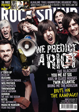
Ideology- Rock sound have made the main feature The gaslight anthem because they have reached a new stage, where they feel like they have improved, they also talk about their new album and what influenced them. This catchers the readers eye, because you want to know what the album is going to be about before its released to help the fans know if they will like it or not. They also talk about their lives, which gives the readers more information on their personality. On the front cover they also show the other bands featured in the magazine, and also tells you that their are free posters inside and that you can win a chance to the sonisphere tour.
Audience- I think that Rock Sound magazine targets an old audience than NME and Kerrang, because its more mature and uses technical language, they also feature more mature bands and also new emerging bands, so i would say that the target audience would be 17-30, i would also say that its targeted more to males than females and would say its slightly sexist as it makes use of more male singers/bands. the SEG would be around C1-D because its targeted for more sophisticated people.
Representation- The gaslight anthem on the front cover are represented as being more mature now after their 3rd album, you can tell this as they are just standing whereas most bands pull faces, they are also wearing the same colours clothes as the colour of the text so that it contrasts. They have also made it clear to show the lead singers tattoo's. On the contents page, the have made a list of pages that have main features on them which is easier for the reader to find what they want. On the double page spread of The gaslight anthem, the band wear reds, blacks and whites, which contrasts with the background as the text is in white with a read border around.
Wednesday 10 November 2010
LIIAR interpretation of the brief
Language- The front cover is the most improtant part of the magazine, as it needs to be appealing and so i am going to use approrpiate colours a maximum of 3, not to mess it up, i will probably use the colours similar to colour of the clothes my band/singer will be wearing. It would be effective to use a mid-shot of the person/people to show their emotion this could also link with the caption and what will be talked about in the double page spread. For the masthead, i need to use a bold font and text to make it stand out, then to make the other pages contrast with the front cover i will use the same font and colour.
Institution- I think if my magazine was produced by an existing company, they would promote it and put it out to the public and that would make it really popular, but i want to go for something different to other rock magazines. As kerrang, NME and Rock sound are all very popular rock magazines, i need to make it appeal to my target audience by making the magazine cheaper or putting a lot more posters/stories in it. I am also going to call my magazine something that represents the genre of music, so that the public know that its a rock magazine.
Ideology- I need my magazine to make a big impact on people, this will be done by making the front cover as best as it can be, by getting a very appealing picture, with juicy headlines, features of other bands, and posters and quizzes.
Audience- My target audience is going to be people that like this specific type of genre ovbiously, i think that mostly young people listen to this genre of music and so i am going to target ages 15-20, although most people would argue that rock/metal is more for males, but through experience i know a lot of females that read rock magazines and also enjoy the music. The SEG im targeting is C2-E, as high class working people from A-C1 would not read this magazine, they are stereotypically into classical, jazz music.
Representation- I think it would be appropriate to make the front cover, be the main story in the actual magazine, as thats the main reason people buy it, because they know that it has a big story on maybe their favourite band. I think its good to represent stories positively and negatively because then it shows that you are not biased towards your own magazine, and you are not biased towards the singers/bands that are going to be in the magazine.
Monday 8 November 2010
LIIAR analysis of NME magazine

Institution- The magazine is called NME, which suggests that its shortened for 'enemy' maybe to show that its an enemy to all other indie/rock magazines. It is also probably the biggest indie/rock magazine in the country, again like Kerrang magazine they have a website for people to access and also a sky channel, which is quite close to the Kerrang channel, which gives the readers even more information as it shows the music video's, this can be more entertaining for the readers.
Ideology- NME magazine have done a feature of Glastonbury festival as its one of the biggest events in the UK and its talked about nearly all year. They have brought this issue out around the time that the festival was starting to give festival goers more information and gives non festival goers an insight to the bands/singers headlining or featuring at Glastonbury. It also goes back to when the festival first started so it also has some history for readers interested. As the caption says its worlds greatest festival and so that encourages and persuades readers to read the magazine but also buy a ticket for that festival.
Audience- I believe that NME again targets a vary of audiences, i would say mostly half indie pop/rock such as bands like Biffy Clyro- Rock, Jamie T- Indie and Florence and the Machine- Indie/pop. As it shows a picture of the bestival on the front cover, the magazine is trying to target quite a young audience 16-24
Representation- The picture on the front cover is represented as being amazing, as you can tell there are a lot of people there and also there are a lot of national flags, which means brings a lot of tourists and influences people from all over the world. They have also made the colours on the front cover blue,red and white which represent the Great Britain flag. The contents page is sectioned off, to show different pages, but all the stories link to the Glastonbury festival. In this magazine, they dont really make use of a double page spread dedicated to the front cover, as every story in this magazine links back to the festival.
Price and issues
as i said in the last post, my magazine is going to target a fairly young audience C2-E and so i will have to make my magazine affordable and i also need it to compete with other existing magazines such as Kerrang, NME and rock sound.
I have researched the price of all 3 magazines,
I have researched the price of all 3 magazines,
- Kerrang = £2.20
- NME = £2.30
- Rock sound = £3.90
My target audience
By using Demographics and Psychographics i have decided on the age, gender and SEG for my magazine, as the genre im aiming for is rock/metal i need to target an audience who's primary genre is also that, as most people that like rock/metal are usually young from ages 15-20 thats the age im targeting. Although people would argue that this genre is more for the male audience i am going to terget both genres, as from my experience i know a lot of girls that read rock magazines and also enjoy the music. Being stereotypical it is common that people that wear dark clothes, have a lot of piercings and tattoo's are most likely to read this magazine. In statistics it is very unlikely that high class people from A-B would not read this magazine and so im aiming for a SEG of C2-E, as the magazine is going to cheap these people can afford it.
Saturday 6 November 2010
genre of magazine i have chosen
I have chosen to do a Rock/Metal music magazine, because I think there are a lot of pop magazines out there which would be very hard to compete with, another reason is because rock/metal is my favourite genre of music so i thought it would be easier to make a music magazine of the genre i like the most. The one thing that would be hard competing with is the amount of advertisements they have as they mostly include details of rock gigs going on around the country or they are promoting new CD's that have been released.
outline of the brief
- Produce a front cover of a music magazine
- Produce a contents page for the magazine
- and also a double page spread (usually of the person/band who is on the front cover)
- Using your own pictures
- Masthead
- Appropriately laid out and correctly spelled text
- rough cover price for magazine
- How often will the magazine be released
- Minimum of 4 images
Friday 5 November 2010
LIIAR analysis of Kerrang magazine

Institution- The magazine is called Kerrang, which could arguably be the biggest rock magazine in the UK, not only that but it also has a music channel on Sky, plus a website which is has a different way of reaching the audience as the magazine does as it allows you to give your own opinions on the stories they talk about, you can enter compitions easily, watch podcasts of bands and also play games, which can be more entertaining to people than reading the magazine.
Ideology- Kerrang have made Hayley Williams the main headline of the magazine for this particular week, so she will have the biggest story in the whole magazine, which suggests that most people will buy the magazine to read about what she has to has to say, other will buy the magazine simply because they like Hayley or the band she is in (Paramore). As the caption says that she has nothing left to give, the readers will want to read it to find out if she's going through a rough time, or if shes going to quite the band etc.
Audience- I believe that Kerrang magazine targets a niche audience, those of which that are into Rock/Metal music you can tell this because of the bands listed on the front cover, so obviously people that like dance or pop music will not be interested in this magazine. Again as its Hayley williams on the front cover, kerrang are trying to engage young male readers 15-20 who dream of dating her and engaging young female readers also as she is their idol and they want to be her. The price on this magazine is £2.20 which is a reasonable amount for people to pay, as it has at least 65 pages including the biggest news and free posters, new issues come out every wednesday, so a lot of the readers dont mind paying £2.20 every week. The SEG for the readers of Kerrang i would say is about C2-E as its targeted to a younger audience.
Representation- Hayley Williams on the front cover is represented to be as if she is lost on her own, and needs somebody to guide her, this connotes with her t-shirt as it says 'security' and is also in the colours of yellow and black which are the colours of hazard and danger. They have made the colour of the rest of the text on the front cover the same as Hayley's t-shirt to show that the limelight is all on her this week. The contents page, makes use of the same colours as the front cover so that it doesnt confuse the reader, also to make it look effective and make the colours contrast with the black and yellow, also telling you what is on the pages, they have placed pictures all around it next to the page its on.
Subscribe to:
Posts (Atom)